Table of contents
Chart patterns are a key component of technical and graphical analysis, which analyses financial markets by studying past price movements. Chart patterns are used to identify potential trading opportunities and predict future price movements.
In this share market chart analysis, let’s take a closer look at each pattern closely.
What is the Head & Shoulders Chart Pattern?
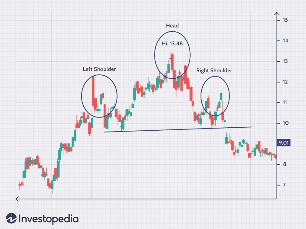
The Head & Shoulders chart pattern predicts a possible trend reversal in the market. This trading chart pattern is named after the shape it creates on a chart – three peaks, with the middle being the highest and the other slightly lower and of similar height, resembling a person’s head and shoulders.
Interpretation and Reading Steps
The Head & Shoulders trading pattern comprises three peaks and two valleys. The first peak is known as the left shoulder, the second peak is known as the head, and the third peak is known as the right shoulder.
The pattern is complete when the price falls below the “neckline,” which is formed by connecting the low points of the left and right shoulders. Traders often use this as a signal to sell or take a short position, as it suggests that the security is about to enter a downtrend.
What is the Reverse H&S Pattern?
The Inverse Head and Shoulders is a pattern that predicts a reversal in downtrends. It’s like the head and shoulders pattern but flipped on its head – hence the name.
- First, the price falls to a low point (trough) and then rises to form a peak.
- The price then falls again, but this time to a lower trough than the first, before rising again.
- Finally, the price falls again, but only to the level of the first trough, before rising again and breaking the previous downtrend.
What is the Parallel Channel Pattern?
The parallel channel pattern is used to identify trends in the stock market. It is formed when a stock’s price moves between two parallel lines, with the upper line representing resistance and the lower line representing support. This creates a channel in which the stock’s price moves up and down, much like the waves in the ocean.
Parallel channel trading patterns can be bullish or bearish depending on the price trends.
The pattern works by identifying key levels of support and resistance. When a stock’s price reaches the upper line of the channel, it is considered to be at a level of resistance. Conversely, when the stock’s price reaches the lower line of the channel, it is considered to be at a level of support.
What is the Flag and Pole Pattern?
The flag and pole pattern is a technical chart pattern that occurs when a stock price experiences a sharp price increase (pole), followed by a period of consolidation (flag), and then another sharp price increase in the same direction as the pole.
There are two types of flag and pole patterns: bullish and bearish.
What is a Wedge Pattern?
Traders use a wedge pattern to identify potential trend reversals in stock market charts. It’s called a “wedge” because the pattern forms a shape that looks like a triangle with two sloping lines converging towards each other.
There are two types of wedge patterns: the rising wedge and the falling wedge.
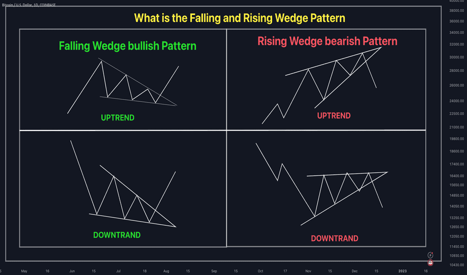
What is a rising wedge pattern?
A rising wedge pattern is a pattern that is formed when the price of a security moves in a narrowing range between two upward-sloping trendlines. This pattern is created when the security price moves higher in a series of higher highs and higher lows, forming a wedge shape on the chart.
The pattern is confirmed when the price of the security breaks below the lower trendline. Traders typically look for a break below the lower trendline to enter a short position, as the security will likely move lower soon.
What is a falling wedge pattern?
A falling wedge pattern is a chart pattern used in technical chart analysis to predict a bullish reversal in the price of a security. It is formed by drawing two converging trendlines, one connecting a series of lower highs and the other connecting a series of lower lows.
The falling wedge pattern is a reliable indicator of a potential reversal in the price of a security, and it can be used to identify potential buying opportunities.
Conclusion
Before you start trading, make sure you have a good grasp of chart patterns and how they correlate to market circumstances.
When analysing chart patterns, it is crucial to apply technical analysis tools correctly. To address these difficulties, it is helpful to have an adequate understanding of the market’s structure and investing methods before delving into the realm of charts.
FAQs
In the Indian stock market, traders often rely on chart patterns to anticipate price movements. While no single pattern is universally “best,” some deserve attention:
Head and Shoulders: A reversal pattern signalling a potential trend change.
Cup and Handle: A bullish continuation pattern.
Double Top/Bottom: Indicates potential reversals.
Remember, context matters. Combine patterns with other tools like moving averages and volume analysis for better results.
A 15-minute chart is a popular choice among day traders for its balance between detail and overview. It provides a granular view of price action, allowing traders to identify short-term trends and key levels for entry and exit points. This timeframe is particularly useful for those who wish to avoid the ‘noise’ of shorter timeframes, like the 1-minute or 5-minute charts, which can be overwhelming due to the high frequency of price movements.
The stock market boasts a rich tapestry of chart patterns. Key ones include:
Trendlines: Simple yet powerful lines connecting highs or lows.
Reversal Patterns: Examples include the Hammer, Doji, and Engulfing patterns.
Continuation Patterns: These signal a pause before the prevailing trend resumes.
Explore these patterns to enhance your trading acumen.
Candlestick charts are highly valued by intraday traders in the Indian stock market for their ability to vividly capture price fluctuations within short timeframes. These charts are composed of individual “candles” that represent price movements within a specified period, providing insights into market sentiment and potential price direction. To enhance the effectiveness of candlestick analysis, it’s common to use additional technical tools like the Relative Strength Index (RSI) or the Moving Average Convergence Divergence (MACD).
Candlestick Charts: These vividly display price action, making them ideal for stock analysis. Each candlestick represents open, high, low, and close prices. Pay attention to patterns like bullish engulfing or doji for insights.
Line Charts: Simple and effective, they connect closing prices over time, revealing overall trends.
Bar Charts: Show open, high, low, and close prices. Useful for detailed analysis.